 All papers examples
Disciplines

- MLA
- APA
- Master's
- Undergraduate
- High School
- PhD
- Harvard
- Biology
- Art
- Drama
- Movies
- Theatre
- Painting
- Music
- Architecture
- Dance
- Design
- History
- American History
- Asian History
- Literature
- Antique Literature
- American Literature
- Asian Literature
- Classic English Literature
- World Literature
- Creative Writing
- English
- Linguistics
- Law
- Criminal Justice
- Legal Issues
- Ethics
- Philosophy
- Religion
- Theology
- Anthropology
- Archaeology
- Economics
- Tourism
- Political Science
- World Affairs
- Psychology
- Sociology
- African-American Studies
- East European Studies
- Latin-American Studies
- Native-American Studies
- West European Studies
- Family and Consumer Science
- Social Issues
- Women and Gender Studies
- Social Work
- Natural Sciences
- Anatomy
- Zoology
- Ecology
- Chemistry
- Pharmacology
- Earth science
- Geography
- Geology
- Astronomy
- Physics
- Agriculture
- Agricultural Studies
- Computer Science
- Internet
- IT Management
- Web Design
- Mathematics
- Business
- Accounting
- Finance
- Investments
- Logistics
- Trade
- Management
- Marketing
- Engineering and Technology
- Engineering
- Technology
- Aeronautics
- Aviation
- Medicine and Health
- Alternative Medicine
- Healthcare
- Nursing
- Nutrition
- Communications and Media
- Advertising
- Communication Strategies
- Journalism
- Public Relations
- Education
- Educational Theories
- Pedagogy
- Teacher's Career
- Statistics
- Chicago/Turabian
- Nature
- Company Analysis
- Sport
- Paintings
- E-commerce
- Holocaust
- Education Theories
- Fashion
- Shakespeare
- Canadian Studies
- Science
- Food Safety
- Relation of Global Warming and Extreme Weather Condition
Paper Types

- Movie Review
- Essay
- Admission Essay
- Annotated Bibliography
- Application Essay
- Article Critique
- Article Review
- Article Writing
- Assessment
- Book Review
- Business Plan
- Business Proposal
- Capstone Project
- Case Study
- Coursework
- Cover Letter
- Creative Essay
- Dissertation
- Dissertation - Abstract
- Dissertation - Conclusion
- Dissertation - Discussion
- Dissertation - Hypothesis
- Dissertation - Introduction
- Dissertation - Literature
- Dissertation - Methodology
- Dissertation - Results
- GCSE Coursework
- Grant Proposal
- Admission Essay
- Annotated Bibliography
- Application Essay
- Article
- Article Critique
- Article Review
- Article Writing
- Assessment
- Book Review
- Business Plan
- Business Proposal
- Capstone Project
- Case Study
- Coursework
- Cover Letter
- Creative Essay
- Dissertation
- Dissertation - Abstract
- Dissertation - Conclusion
- Dissertation - Discussion
- Dissertation - Hypothesis
- Dissertation - Introduction
- Dissertation - Literature
- Dissertation - Methodology
- Dissertation - Results
- Essay
- GCSE Coursework
- Grant Proposal
- Interview
- Lab Report
- Literature Review
- Marketing Plan
- Math Problem
- Movie Analysis
- Movie Review
- Multiple Choice Quiz
- Online Quiz
- Outline
- Personal Statement
- Poem
- Power Point Presentation
- Power Point Presentation With Speaker Notes
- Questionnaire
- Quiz
- Reaction Paper
- Research Paper
- Research Proposal
- Resume
- Speech
- Statistics problem
- SWOT analysis
- Term Paper
- Thesis Paper
- Accounting
- Advertising
- Aeronautics
- African-American Studies
- Agricultural Studies
- Agriculture
- Alternative Medicine
- American History
- American Literature
- Anatomy
- Anthropology
- Antique Literature
- APA
- Archaeology
- Architecture
- Art
- Asian History
- Asian Literature
- Astronomy
- Aviation
- Biology
- Business
- Canadian Studies
- Chemistry
- Chicago/Turabian
- Classic English Literature
- Communication Strategies
- Communications and Media
- Company Analysis
- Computer Science
- Creative Writing
- Criminal Justice
- Dance
- Design
- Drama
- E-commerce
- Earth science
- East European Studies
- Ecology
- Economics
- Education
- Education Theories
- Educational Theories
- Engineering
- Engineering and Technology
- English
- Ethics
- Family and Consumer Science
- Fashion
- Finance
- Food Safety
- Geography
- Geology
- Harvard
- Healthcare
- High School
- History
- Holocaust
- Internet
- Investments
- IT Management
- Journalism
- Latin-American Studies
- Law
- Legal Issues
- Linguistics
- Literature
- Logistics
- Management
- Marketing
- Master's
- Mathematics
- Medicine and Health
- MLA
- Movies
- Music
- Native-American Studies
- Natural Sciences
- Nature
- Nursing
- Nutrition
- Painting
- Paintings
- Pedagogy
- Pharmacology
- PhD
- Philosophy
- Physics
- Political Science
- Psychology
- Public Relations
- Relation of Global Warming and Extreme Weather Condition
- Religion
- Science
- Shakespeare
- Social Issues
- Social Work
- Sociology
- Sport
- Statistics
- Teacher's Career
- Technology
- Theatre
- Theology
- Tourism
- Trade
- Undergraduate
- Web Design
- West European Studies
- Women and Gender Studies
- World Affairs
- World Literature
- Zoology
Burger King vs McDonald, Essay Example
Hire a Writer for Custom Essay
Use 10% Off Discount: "custom10" in 1 Click 👇
You are free to use it as an inspiration or a source for your own work.

McDonald’s is the biggest fast-food company in the world in terms of sales and operates more than 33,500 restaurants in 119 countries. The company has more than 14,000 locations in the U.S. alone and in addition to stand-alone locations, the company also has eateries located in airports, shopping malls, and other high-traffic areas. About 80 percent of McDonald’s restaurants are managed by franchisees or affiliates (Hoovers).
Burger King is the second biggest fast-food company in the world, only behind McDonald’s. The company operates more than 12,300 restaurants in more than 75 countries including the U.S. Like McDonald’s, Burger King also operates both stand-alone locations as well as eateries at busy locations such as airports and shopping malls (Hoovers). It is almost impossible to think of a way in which internet has not influenced our daily lives. We seek information on the internet, we communicate through internet, we shop on internet, and internet has also become a major marketing and customer service tool for companies. The concept of 24-hour connectivity is finally becoming a reality due to internet-powered smart phones that are fast becoming a mass-market commodity. Thus, it is only natural that two of the biggest fast-food companies in the world will invest in a website that caters to the customers’ and other stakeholders’ shopping and information needs. But like any other competitive tool, the website may also be turned into a core competency if planned and designed properly. This paper analyzes both McDonald’s and Burger King’s websites to determine which company has done a better job of achieving the purpose of having a website.
Paper Design
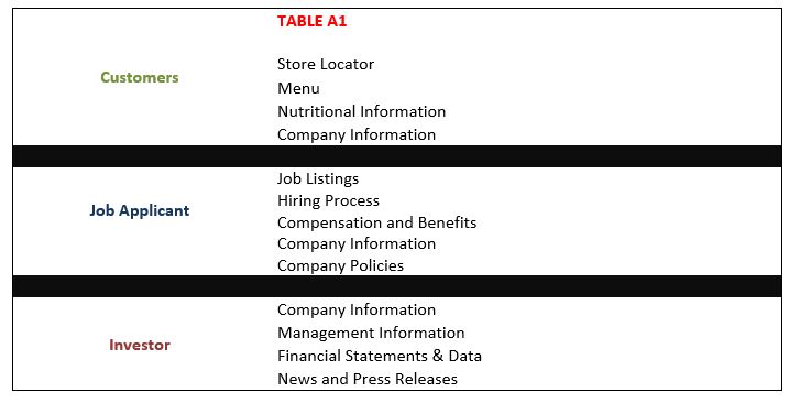
The table A1 shows the tasks that were performed in order to do a critical and comparative analysis of both companies. The right column shows the most common objectives behind a visit to the website by the respective stakeholders.

McDonald’s
Homepage
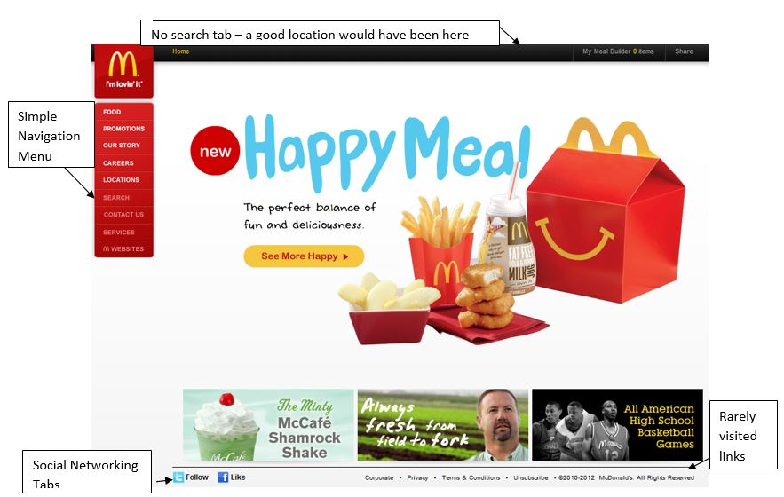
McDonald’s website address is intuitive because it simply adds .com to the company’s name. It didn’t take long to notice the carefully planning and thought that went into designing the homepage. The company understands that its customers come from all kind of backgrounds whether education, professional, social, or any other. Thus, the company has designed its web page as simple as possible to avoid unnecessary distraction and allow the visitor to fulfill the purpose of his visit. There is minimum flash animation which is a wise thing because some users may have older and slower computers or internet connections. The company has carefully located the information menu on the right which is where website visitors while less frequently visited links have been located at the bottom of the page.

The company has also incorporated social networking icons at the bottom left of the page which demonstrates that the company’s commitment to harnessing the power of social networks. The company mainly uses the homepage to market new items or promote a marketing campaign of strategic importance. One basic shortcoming of the page was inappropriate location of search feature. Some customers may not be internet-sophisticated and would look for search tab on the top right where most websites usually have. In fact, I didn’t notice search tab right away and only after some time. I almost thought the homepage doesn’t have any search tab because it was located at the bottom half of the tabs menu and not as visible as tabs with white font at the upper half of the tabs menu.
Navigation
The website has also been well-designed in terms of navigation. A simple mouse cursor over the tabs in the Menu reveals an extended submenu with all the related information links. This saves time for the user and also encourages him to explore the website. This instant-extension also gives the users a quick idea of the information available on the website and to some extent, compensates for lack of search tab on the homepage. Almost all the tasks we earlier identified in the table A1 could be performed through the Tab Menu on the homepage except those usually performed by current and potential investors. But the later shortcoming is of little importance because investors who study company information and financial statements are usually expert website browsers.
It was apparent from the navigation that easy information search must have been one of the primary design objectives behind the website. The biggest surprise turned out to be the failure of location finder. When we tried to search the store by zip code, the page showed error and it happened multiple times. But once we succeeded in obtaining the location information, the search results were very informative. Not only the location results page shows the visual map and addresses but also distance and facilities at each location. A mouse cursor over the address reveals contact information which again demonstrates that the website has been particularly designed to enable quick information search. A possible explanation of the initial location search page failures may be the inadequacy of stress-tests that might have been carried out on the website and apparently, the website sometimes receives more traffic than it can handle. Finding job related information was also quick and easy. The company often used summarized information to make it quick for job-seekers to understand information. The company realizes a substantial proportion of job seekers are looking for crew positions and may get confused by comprehensive and detailed information.

Layout
The most dominant color in the homepage and overall on the website is white which is easy on the eyes and doesn’t distract like some other bright colors. White color also makes a pleasant background because it is an effective contract to most colors. As we go through different links on the tabs menu, the white background is replaced by pictures that represent the nature of the tab. For example, we see people in the background on the ‘careers’ page, char and tables on the ‘location’ page and so on. Another thing a visitor notices is that most information-oriented pages accessed through the tabs menu have similar layouts. We have introduction in the center, information links on the right, and promotional material on the bottom right. This helps the visitor quickly become familiar with the layout of the website.
Burger King
Homepage
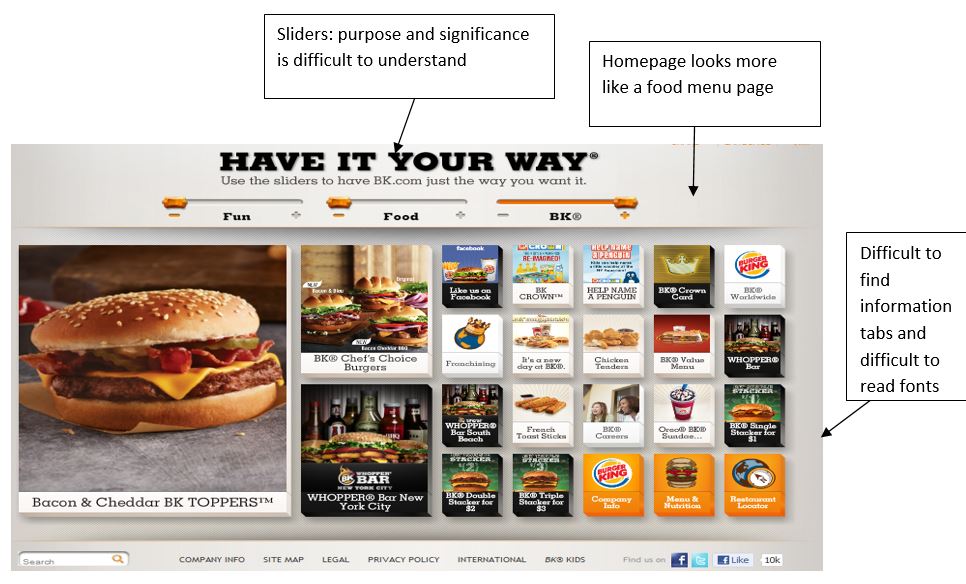
I first wrote www.burgerking.com in the browser’s tab to see whether it will take me to the company’s website or somewhere else. The experiment showed that the company owns both www.burgerking.com as well as www.bk.com URLs to prevent any commercial exploitation of the company’s brand. Like McDonald’s Burger King also targets almost every customer segment imaginable, at least in developed countries like the U.S. Thus, it was a shock to see the company’s homepage which seems more like a homepage of a gaming website than a fast-food company’s website. There is extensive use of pictures and the written information below them is often very difficult to read. Only after going through every picture, I noticed ‘Menu & Nutrition’ and ‘Restaurant Locator’ tabs at the bottom right of the page. The first impression on the home page is that every tab denotes one of the company’s burgers or another food product. In contrast with McDonald’s, the links useful to current and potential investors are easier to find than those relevant to the customers.

The confusion doesn’t end at finding the information. The homepage shows three sliders whose purpose will confuse most visitors. Changing the position of each individual slides simply repositions the different tabs on the homepage though the methodology is not clear. Another thing that surprised me was that the year next to the trademark is still the year 2011 whereas it is 2010-2012 on McDonald’s website. My initial expression was that the company built the website without proper planning and more focus was on the visual appeal than ease-of-finding information or the needs of the different stakeholders such as customers, investors, and job-seekers. The fact that there were still errors on the homepage such as older year next to trademark shows that the website is not perceived by management to be one of the primary competitive tools.
Navigation
The navigation is difficult and time-consuming right from the home page. A significant proportion of visitors may be turned-off and leave the website without fulfilling the purpose of their visit. Another thing I noticed was that putting mouse cursor on the tab often doesn’t reveal extended information and instead merely a description of the tab. Finding information often requires navigating to other pages which is again time-consuming. Unlike McDonald’s homepage, where location information could be put right on the homepage, location information can only be put after clicking on the location tab and going into the location page. The search results do show contact information, distance, and visual map but not the features of the location, unlike McDonald’s.
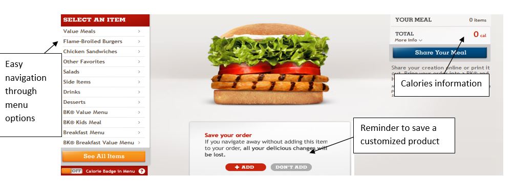
One positive feature of the website was the ease of customizing food or producing a shopping list which could be printed and taken to a nearby restaurant. Moving through different food items is easy and if you move to another product without saving a customized product, the website reminds you and saves you the inconvenience of creating the product again. In addition, the calories and allergens information is also visible as we create the menu.

Layout
It is apparent that the company has put more focus on promoting its products than meeting the information needs of the different stakeholders. The fonts are often very difficult to read and information is a time-consuming and confusing task. Often finding the required information is a trial-and-error exercise. For e.g. on the career page, itself found only after looking at all the picture tabs on the main page, it is not apparent how one applies for a corporate job or a crew job. Initially, I thought that the picture-wheel at the top of the page just showed happy employees or possibly their testimonials but the employees actually represent introduction to the employment opportunities at various departments at the corporate offices. The overall design of the website has resulted in too many web pages and information is scattered on different pages. Another issue is information overload because long information pieces will discourage most visitors from reading all the information. Like McDonald’s demonstrates, it is possible to convey information as a summary without sacrificing the quality of the overall message. One thing consistent throughout the website is the grey background which does remind us of the company’s restaurants. The website does have a unique ‘Burger King’ feel.
Conclusion
I believe McDonald’s has done a much better job of designing the company’s website than Burger King. McDonald’s website demonstrates that the company put significant energy into making sure that the website effectively meets the information needs of different stakeholders and finding information is quick and convenient. In contrast, Burger King’s website gives the overall impression of mostly being a virtual menu of the company’s food products. The website is difficult to navigate, finding information is time-consuming, and fonts are difficult to read. In addition, the information overload on some web pages may also exhaust the visitor.
References
Hoovers. Burger King Holdings, Inc. . 18 March 2012 <http://www.hoovers.com/company/Burger_King_Holdings_Inc/hchyri-1.html>.
McDonald’s Corporation. 18 March 2012 <http://www.hoovers.com/company/McDonalds_Corporation/rfskci-1.html>.

Stuck with your Essay?
Get in touch with one of our experts for instant help!

Time is precious
don’t waste it!
writing help!


Plagiarism-free
guarantee

Privacy
guarantee

Secure
checkout

Money back
guarantee

