Visual Portfolio, Research Paper Example
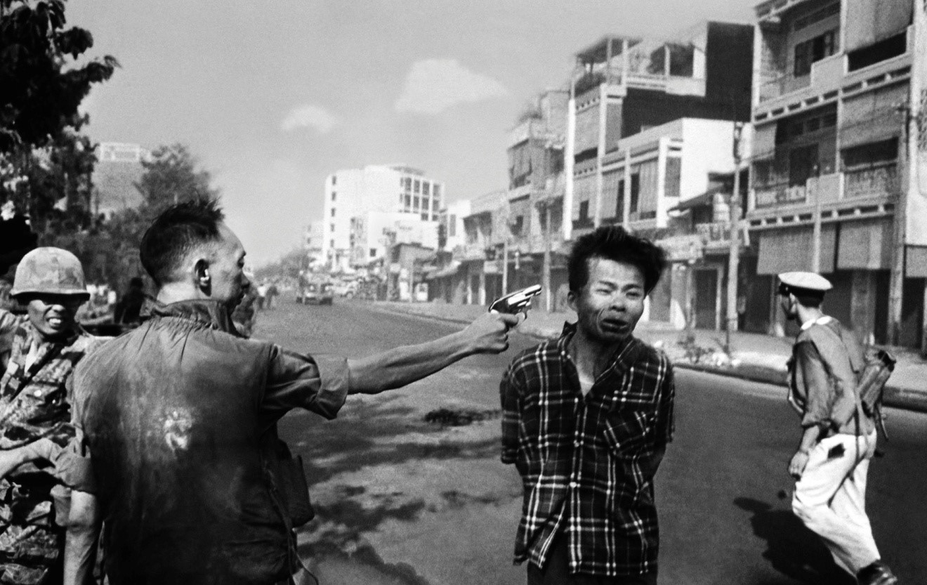
Image 1: South Vietnamese General Nguyen Ngoc Loan executes Viet Cong officer. Photo taken by Eddie Adams, 1968. Categories: 20th century, documentary photography.
The first image is a photograph that has become famous. In 1968, the Viet Minh and Viet Cong launched the Tet Offensive, pushing southward into South Vietnam. During the fighting, photographer Eddie Adams captured a shocking image that would end up making quite a bit of history. Adams captured South Vietnamese General Nguyen Ngoc Loan shooting an unnamed Viet Cong officer through the head at point blank range. The photograph produced a wave of public revulsion and shock in the United States, where there was already a substantial feeling of consternation about US participation in the war after the Tet Offensive (BBC). The result was that the photo became one of a number of symbols of the injustices that America was supporting in the war. The trouble is, the photograph provides absolutely no sense of the real context: that Viet Cong officer had just killed at least eight people, which is why General Loan executed him. Right or wrong, the general’s actions were in the midst of a war zone against a man who had proven himself dangerous. The general was haunted for the rest of his life by the image (BBC). This image presents an excellent example of the power of the photograph, especially when one considers the back story. It is a visually arresting image: General Loan’s arm, outstretched with a gun clasped in his hand, commands attention (Campbell et al. 56-57). Everything about his posture is so vivid, commands so great a force of implicit motion, that one expects to see his arm move with the recoil of the shot. The Viet Cong prisoner’s face is, if anything, even more compelling: the man’s eyes are closed and features are crumpling with the blast. The other figures, including what appears to be a soldier or policeman who is running in the background, contribute to the sense of this being a war zone. The photo is black and white, but that only makes the contrasts more vivid and apparent: the light on the prisoner’s face, the shadow on the lower part of his face and his front, what appears to be sweat or blood on General Loan’s jacket. Everything about the composition suggests violence. The two subjects, the general and the prisoner, are center stage and the focus of the image is clearly on them, but one can enough of the surroundings to confirm the impression of conflict and urgency (Campbell et al. 56-62). In effect, the photo primes the audience to see it in a certain way: it seems very unambiguous, and it represents something violent and shocking to those who are not used to such sights (Berger 6-9). In essence, this photo furnishes evidence and recreates a part of the world (Sontag 4-7). It is an intrinsically aggressive image, given its subject, and arguably given the degree to which it strips its subject of context as well. It is powerful, compelling, and demands a reaction: indeed, one almost feels as if one must wince upon looking at it, so incredibly vivid and powerful is it as a representation of reality (Sontag 6, Foucault 360-362).
In a very real sense, it renders the subject in a form that the gaze of the viewer can take in: it makes the subject of the photograph subject to the power of the viewer. In a very real sense, it commands the viewer’s attention and forces them to confront this violent, disturbing image. In effect, it demands a reaction, demands that the viewer not only pay attention to it but respond to it by condemning, or at least being aghast at, the brazen shooting of what appears to be an unarmed man at point blank range. Thus, like the Panopticon, this photograph functions to reify power, but the oculus is not the eye of the viewer. Instead, it is the lens of the camera, since the lens of the camera was responsible for capturing the image and representing it, literally re-presenting it as a distillate, a concretization, of reality. Indeed, the preferred meaning here could not be clearer (Hall 216-220). Given the actual context, and the consequences of the photo for General Loan, it is a clear demonstration of the power of ways of seeing, and how they can shape reality.
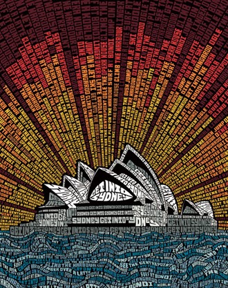
Image 2: Typography Sydney Opera House. Categories: graphic design and typography, advertising.
This image presents a tourism ad, designed to encourage people to visit Sydney. The Sydney Opera House takes pride of place, serving as a symbol of culture as well as an important symbol of Australia. At the same time, it is re-presented as text, encouraging the reader to “Get Into Sydney.” Thus, the image manages to signify culture, Australia, and a certain tone: it does not take itself too seriously, and everything about the presentation encourages the reader to come to Sydney to have a good time. The color scheme is extremely powerful: the white and gray text of the opera house is set against a black background, and the opera house as a whole is set against both blue and gray wave-text and a sunburst form, replete with red, orange, yellow, and brown. The color scheme and the visual arrangement both draws attention to the opera house and projects power beyond it with the sunburst form. The eye is drawn from the darker space at the top down the rays of the sunburst to the opera house, but the brighter red at the ends of the sunburst beams also draws the eye back. Thus, there is an inherent tension in the image, which lends it a very compelling power: it is busy, alive, and the words seem about ready to crawl on the screen (Campbell et al. 60-67, Hall 219-234, Pelzer 204-207).
The form and the content, then, give this image its power. The eye is drawn to it, and encouraged to roam around it. The messages are clearly not intended to be taken at face value, or at least not completely seriously, since they say things like “Cuddle a koala” and “Surf at Bondi” and “Dine on kangaroo.” True, tourists might enjoy doing all of the above, but in the way that the messages are presented they are clearly at least partially in jest. The true meaning of this text is an encouragement to tourists to come to Sydney because it will be fun and active: such a meaning is implicit from the activities suggested, as well as the way in which the image presents them. Thus, the content and the meaning work together, but they work together in a way that creates an additional, implicit text beneath the stated text (Howells and Negreiros 34-36).
Fundamentally, of course, this is an ad and it is trying to sell people things. Specifically, it is trying to sell them fun, and in service of this it is trying to sell them a specific image of Sydney as a fun place (McClintock 200-207). For this to work, Sydney, and especially the opera house, must be repackaged and represented. A photograph cannot do what this ad can do: this ad can present a stylized Sydney, using the color and form of the text to portray an opera house that seems about ready to crawl. It is an active, busy image, one that keeps the eye occupied and bombards the reader with messages while at the same time maintaining a kind of ironic distance because, after all, it is really all in fun (Campbell et al. 65-70, McClintock 205-210, Mirzoeff 99-110). By packaging Sydney and especially the Sydney Opera House in this fashion, the ad makes them saleable.
The colors, the form, everything about the ad is designed to entice and draw the reader-viewer in. Sydney itself becomes a text to be read and interpreted by the viewer in the way that the advertisement presents it. Thus, there is a very real sense of power here, too: Sydney is what the ad conjures it to be, how the ad represents and repackages it to the viewer’s gaze—and hopefully, from the standpoint of the image’s creators, the viewer’s wallet as well. Sydney is to be consumed by the viewer, and consumed in the fashion that the ad suggests. Beneath the semi-ironic suggestions lies an attitude, an ethos: Sydney is to be experienced in an exhilarating way, one that will send the viewer-reader on many adventures. This, then, is the underlying message behind this ad: it is selling the viewer a certain image of Sydney in order to sell the viewer the idea that they are the sort of person who would enjoy having those types of experiences in that Sydney. By so doing, the ad works to commoditize reality (McClintock 210-215).
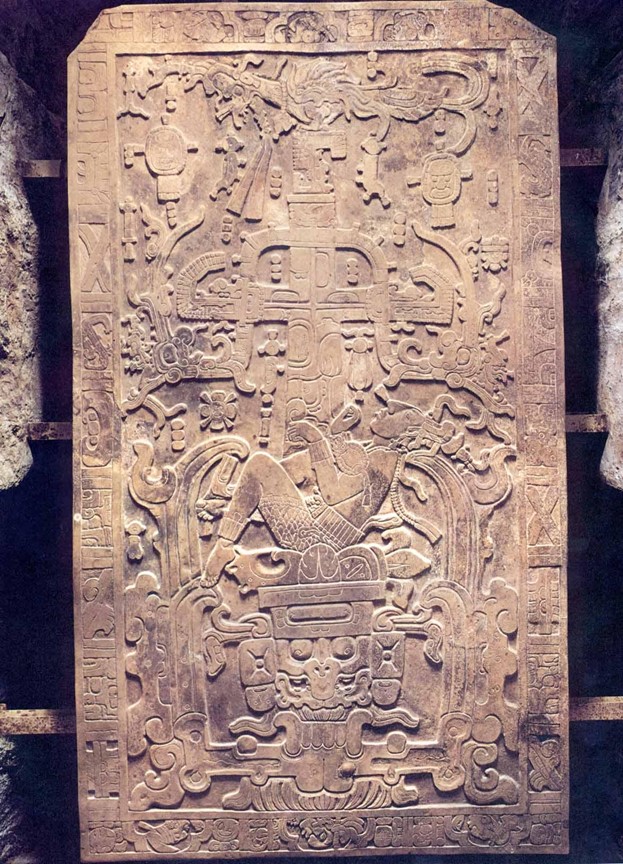
Image 3: sarcophagus lid of King Pacal of Palenque, ca. 683 CE. Categories: art, non-Western culture (ancient Maya), pre-20th century.
The dying king descends the trunk of the great World Tree, his limbs akimbo, suggesting movement. The gaping jaws of a monstrous underworld piece yawn open, ready to receive him into Xibalba. The king lies upon a creature that represents Kinich Ahau, Lord Sun, descending with the sun into the underworld. It is the sunset of the reign of a mighty king in Palenque, a king who left his mark on the picturesque architecture of that great city in the land of Chiapas (Stokstad 459-460). But is Pacal’s sun setting, or rising? In the cosmology of his people, Kinich Ahau descended every night into the depths of Xibalba, bathing the land in darkness save for the light of moon and stars. Every morning, however, Kinich Ahau rose triumphant from the jaws of the underworld, having in effect died and resurrected.
Pacal’s sarcophagus lid has, therefore, two meanings at the very least, and they are bound up into one. In a collective or ecumenical sense, the lid of the sarcophagus is both a statement of death and rebirth, a testament to Pacal’s shedding of the mortal coil and the promise of rebirth in Xibalba (Stokstad 460). Of course, this message has at least two component parts: death, and rebirth. Pacal is represented in a fashion that is designed to encourage the audience to think of him as occupying two states in conjunction, death and rebirth (460). These two are perceived to be a fundamental duality, much as the Christian cannot talk of Christ’s death on the cross without also speaking of his resurrection on the third day, and vice versa.
The significance of this should not be missed: as a dualistic symbol of a sacred process that occurs in the realm of supernatural entities, Pacal’s depiction is not intended to be viewed with the preferred Western, modern conception of time. The Western conception of time thanks to modernity and especially thanks to capitalism is a linear temporality: two different things can only happen at the same time if they are not contradictory, and do not involve the exact same object(s) or people, etc. Causality, then, follows a single track. With Pacal’s sarcophagus lid, however, the viewer is invited to consider two events happening as part of an interdependent cycle. Again, the example from the Christian faith is apropos, since it too concerns events happening in the realm of the supernatural, and since it too is based on a pre-modern, pre-capitalist temporality. For the Christian, the cross is worn not as the symbol of Roman execution that it once was, but rather as a symbol of hope: humanity’s sinfulness expiated by the grace of a loving God, in the form of Christ’s sacrifice. And why is that death meaningful? Because Christ is God, making him a perfect sacrifice, and enabling him to overcome death. The cross, then, points to the empty tomb, and the empty tomb points to the cross. This is easily the only conception with which most Westerners are familiar that can even begin to serve as an analogy for the cosmology and eschatology represented in Pacal’s sarcophagus lid. For Pacal and his subjects, the meaning would have been as clear as the cross and the empty tomb are for Christians, or as clear as the Passover is for believing Jews: in dying, the king is also reborn. Visually, everything about the image works to enhance the message. Form and content work together. The eye is drawn from the celestial bird atop the great World Tree down its trunk to King Pacal, and thence to the gaping jaws of the underworld monster. It is carved in relief, which makes the image a visually powerful one, even to a gaze as alien as that of the modern Westerner, although the symbolism is likely to prove impenetrable to the untrained eye. Perhaps the most rewarding thing about understanding this image in light of the cosmology that informed it is the way that it depicts King Pacal in what seems to be a vulnerable pose: he leans back, his limbs akimbo, and he is received by the jaws of the monstrous creature that functions as the entrance to Xibalba. Once one understands the true meaning of this image, however, it is obvious that the very vulnerability of his posture is itself a declaration of power, since—after all—he is being reborn at the same time as he is dying. Thus, this image concretizes and re-presents the sacred reality of passage from the mortal existence to the second life, the afterlife, giving the viewer a clear preferred meaning (Berger 7-10, Campbell et al. 63-70).
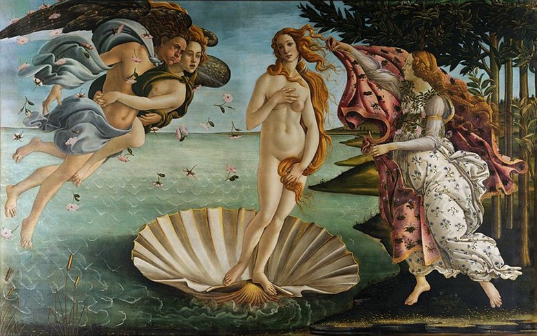
Image 4: The Birth of Venus, Sandro Botticelli. Categories: art, pre-20th century.
Botticelli’s masterful painting marks the return of the unashamed female nude to Western art after the Middle Ages (Hagen and Hagen 93). The subject matter is quite thoroughly pagan, since after all it depicts the emergence of the goddess Aphrodite (or Venus, to the Romans) emerging from the shell which bore her out of the ocean. In terms of the composition, the goddess is demure, standing ready to be robed by one of the Horae, the Goddess of the Spring, who approaches Venus with a mantle at the ready. Venus is flanked on her right and the viewer’s left by the wind god, Zephyrus, and his love Aura, who clings to him. Their breath blows Venus toward the shores (Deimling 52).
The goddess Venus stands, ready to be received by the Goddess of the Spring. There is implicit movement in her stance: she puts her weight on one foot, her other raised slightly, creating a counterpoised stance. She holds her lovely hair over her sex, and her tresses seem to catch the wind somewhat. The Goddess of the Spring holds up the mantle with one arm, creating an obvious line that suggests motion, something reified by the mantle flapping in the breeze (Campbell et al. 54-58). There is a narrative significance here, since the Spring Goddess’s movements relate to her part in the tableau. Zephyrus and Aura, too, are positioned in a way that gives them narrative power and participation in the scene (58-62). The collective effect is to create a focus on the goddess, who is at the center of the picture and thus occupies the place of greatest importance.
The color scheme is particularly lovely and intricate. Venus herself has light, almost marble-hued flesh, which forms a nice theme with the inside of the clam shell. Her complexion is the lightest of any of the figures, though Aura and the Spring Goddess are also quite light. Handsome Zephyrus has a darker complexion, suggesting more time out in the sun. Venus’s light skin also creates a lovely color scheme with her golden tresses, which in turn are complemented by the bronze hue of the outer part of the clam shell, just visible in the painting. The other women also have very similar colored hair. All of this is brilliantly set against cooler colors, light blue and a light sea green: the sky, the sea, Zephyrus’ garment. Then there is the darker green of Aura’s garment, and the verdant pasturage of the land—offset yet again by the lovely pink mantle the Spring Goddess is raising, which in turn is decorated with green. It is a superlatively masterful composition, one that creates a beautiful blend of tones. The colors create contrasts, as between the hues of flesh and tresses on the one hand, and the hues of sea and sky and land on the other, but they also complement each other—the pink arguably ties everything together.
The male gaze is certainly evident in this lovely masterpiece, given the goddess’s nudity. There is a remarkably good case, however, that there is a kind of duality about the work: Venus is both the glorious pagan goddess, Venus Gloriosa as it were, and, in the demure and chaste way she covers her bosom and her sex, Venus Pudica, Modest Venus (Deimling 52, Hagen and Hagen 93). She is demure and unabashed, both at the same time, and that is the seeming paradox. It will be nearly four centuries before William-Adolphe Bouguereau will revisit the subject with his own interpretation, portraying Venus Gloriosa sans any trace of Venus Pudica. However, Botticelli was faced with very different conventions and expectations, given the era and the novelty of his statement, and as such his work navigates the tension between conventions and pagan pulchritude admirably.

Image 5: Affligem Tripel (author’s own). Categories: personal.
This image is one of my own, a picture of an Affligem Tripel I had one night. The composition is inviting, enticing: everything about it suggests that the viewer is in for a treat if they purchase and consume Affligem Tripel Abbey Ale. The ale itself is a tawny golden color, nicely juxtaposed against the foamy white of the head, and the blue and white of the mural on the wall behind it. The color scheme is really quite masterful, inasmuch as it also includes red, green, a light off-white or tan, and golden colors all on the bottle.
What this image represents is an exercise in the marketing of a product and an experience. The viewer is encouraged to drink the abbey ale because it is presented in an attractive manner, one that suggests it will be cold, refreshing, and pleasant in the way that only a good cold beer can be. The goal of the image is to recreate and re-present the reality of many different beer drinking experiences: viewers may have had many different experiences drinking beer, and the goal of this image is to draw on the better experiences and encourage viewers to see themselves having such experiences with this beer. It also encourages them to imagine this beer having particular properties that are eminently desirable, thus the color scheme: it is a cold, refreshing beer, it is a beer for people who love beer. The fact that it is Belgian will also appeal to Americans who esteem Belgian abbey ales (and rightly so!) and who accord beers higher status if they are Belgian abbey ales. The label conveys associations with authenticity, effectively grounding the Belgian abbey ale in the brewing traditions of that land and specifically its monks. Thus, this image conjures a desired state of reality and encourages the viewer to imagine themselves enjoying that (Campbell et al. 65-70, McClintock 205-210).
Works Cited
BBC. “In pictures: The Vietnam War.” BBC. BBC, n.d. Web. 25 March 2014.
Berger, John. Ways of Seeing. London: BBC, 1972. Print.
Campbell, Richard, et al. Media in Society: A Brief Introduction. New York: Bedford/St. Martin’s, 2013. Print.
Deimling, Barbara. Sandro Botticelli: 1444/45-1510. 2nd ed. Los Angeles, CA: TASCHEN America, 2004. Print.
Dikovitskaya, Margarita. Visual Culture: The Study of the Visual After the Cultural Turn. Boston, MA: Massachusetts Institute of Technology, 2005. Print.
Foucault, Michel. “Panopticism.” Discipline and Punish. Reprinted in Neal Leach, ed. Rethinking Architecture. London/New York: Routledge, 1997 [1958, trans. 1969]. Print.
Hagen, Rose-Marie, and Rainer Hagen. What Great Paintings Say. Los Angeles, CA: TASCHEN America, 2003. Print.
Hall, Stuart. “The Spectacle of the Other.” Representation: Cultural Representations and Signifying Practices. Ed. Stuart Hall. Thousand Oaks, CA: SAGE Publications, Ltd. 216-289. Print.
Howells, Richard, and Joaquim Negreiros. Visual Culture. 2nd ed. Malden, MA: Polity Press, 2012. Print.
McClintock, Anne. Imperial Leather: Race, Gender, and Sexuality in the Colonial Context. New York: Routledge, 1995. Print.
Mirzoeff, Nicholas. An Introduction to Visual Culture. New York: Routledge, 1999. Print.
Pelzer, Ruth. “Technical Reproduction and its Significance.” Exploring Visual Culture: Definitions, Concepts, Contexts. Ed. Matthew Rampley. Edinburgh: Edinburgh University Press Ltd., 2005. 197-213. Print.
Sontag, Susan. On Photography. New York: Picador, 1973. Print.
Stokstad, Marilyn. Art History. 2nd ed. Upper Saddle River, NJ: Prentice Hall. 2002. Print.

Time is precious
don’t waste it!

Plagiarism-free
guarantee

Privacy
guarantee

Secure
checkout

Money back
guarantee


